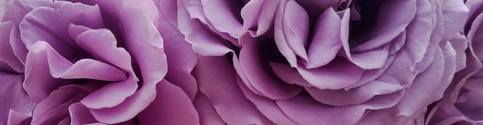
I played here with paint and image transfer. I’m not so keen with the green dots, because they have more blue in them than I’d like, while the painting has more yellow. By the time I realized this, though (I made it in my dimly lit office at night), it was too late to remove them without ruining the piece. I really enjoy image transfers, but they are a challenge to get the paper off (even after a long soak in warm water) while keeping the image intact.

I think this is really beuatiful!!
I think it is a lovely piece with good balance. The image transfer is fabulous!
This is lovely! Transfers are difficult at times but these look great.
I love the organic quality of this. Beautiful.
This is wonderful! Thank you for sharing…. 😀
This is a beautiful piece, but I agree with you about the dots. I also think they would look better if they were not so shiny. Maybe you can put a wash over them.
Hi Norma — I hadn’t thought of using a wash. Thanks!
Very pretty, I like the dreamy quality.
This is so lovely — but I actually like the dots for some reason I can’t pinpoint.
I really love this as well!
What a great project using the image transfer. I like the way your colors work together. Beautiful.